Thanks to everyone who responded. The poll regarding the MLI dialog font had a much bigger turnout than I expected. You guys are awesome!
To get the following results, I took every person’s post and added 1 to the tally of each font they spoke positively towards, and then subtracted 1 from the tally of each font they spoke negatively towards. I didn’t explicitly say you could list more than one font, but most people did, so I figured this would be the most fair way to make sure that everyone’s full opinions are fully accounted for.
That said, as far as the results go… oh dear. I feel a bit like Twilight in The Ticket Master right about now. Full results after the break.
So without further ado, the results look like this:
#1: 21
#7: 7
#3: 3
#6: 3
#5: 2
#4: 0
#2: -1
Keep current: 23
hurrrr use wingdings: 2
As far as the proposed new fonts go, #1 is the clear winner. On the other hand, however, basically an equal number of you also spoke positively with regards to keeping the current font as is. Some of you suggested that I could include in the options menu the ability to pick between multiple fonts, but that unfortunately isn’t really a feasible option – since different fonts have different widths, a message that might fit within the dialog box in one font might not fit in another font. As such for ease of testing it’s much better to just have one font and one font only.
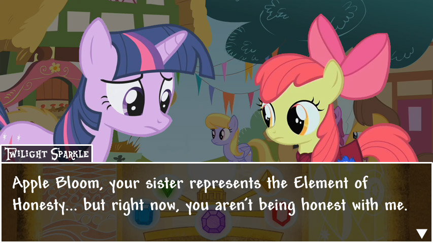
Soooo… yeah. This is pretty much down to a judgment call on my part. I won’t keep you in suspense; after some deliberation on the subject, I’ve picked font #1 as the new font for the game’s dialog:
So now the obvious question: why’d I pick this font? At face value, it seems as though keeping the current font should’ve won just based on the numbers; however, there were a number of considerations that lead to this decision:
- This wasn’t a formal election; this was just an unscientific poll, so 23-21 is basically effectively a tie, statistically speaking, rather than a win for the former.
- Almost everyone who said that they wanted to keep the current font also spoke positively with regards to #1, whereas the same was not true of those who spoke positively of #1. In other words, #1 seemed to be considered acceptable both by those who wanted the current font to stay and by those who wanted it to go.
- The more I look at the current font, the more I feel as though those who note that it’s in ALLCAPS have a point, and the more I feel as though it would become progressively more annoying as the game progressed. Some of you commented that the font seemed to be a trivial thing to be fretting about, but I actually don’t think that’s the case – a huge portion of this game is reading dialog, so it’s something that has to be perfect in every way for the game to really have lasting appeal.
- Of the proposed fonts, it’s definitely closest to my vision as well regarding what the font should look like, in that it’s rounded at the corners and playful in nature, rather than serious and official in appearance.
So that’s about the long and short of it. Thanks again to everyone for your participation in this bit of fan feedback. Hopefully, if you don’t like this decision, you at least can understand where it came from, and can still enjoy the game.
Thanks!
-Gabu