I haven’t been working on this that much lately – was taking a break for the second half of last week, and then over last weekend I was down in Northwest Bronyfest having a good time meeting some of you awesome folk! However, now I’m back, and about ready to get back in business. First off, however, I want to talk about, and get input from you on, a topic that keeps coming up in viewer feedback: namely, the font choice for the dialog in the game.
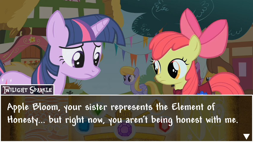
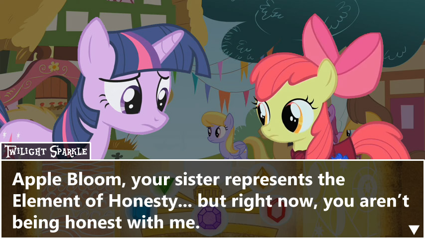
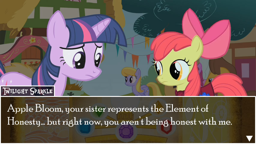
Currently, it looks like this:

(If it’s not clear, I’m talking about the font for “Apple Bloom, your…”)
Now, let me be clear: I still like this font. I chose it rather than a font more closely approximating the Ace Attorney font because I felt that Friendship is Magic is much softer around the edges than Ace Attorney was – both in terms of dialog and in terms of content – and I felt that I should pick a font for the dialog that reflected that. And this comic book-style font seemed to fit nicely.
However… if there’s one single thing that the entire MLI fan base seems to be united against, at least as far as I can tell… it’s this font. Every time I check on people talking about MLI, the one thing that always seems to come up as the thing they don’t like is that font. I’ve already accepted from the outset that I can’t please everyone… but something that pleases no one is, well, a little different. So, I’m officially giving you the chance to have your voice heard on this topic, since I’m quite seriously pondering changing that font to a different one. (Alternately, if you do like the font and would like to keep it the way it is, please tell me – I’ve literally had no one say so, so if you’re in that boat, please let that be known!)
More info after the break!
I will say up front that I won’t promise to change the font. If one of the following things are true, I’ll leave the font as is:
- As many people tell me to keep the font as tell me to change it to a particular font; or
- There is absolutely no identifiable consensus regarding which font would be better.
To facilitate this exercise, I’ve put together seven mockups of the same scene as the above, but with a different font. Basically, what I’d like from you, the reader, is to tell me three things:
- Whether you think the font should be changed at all. If you don’t, then no need to answer the next two questions.
- Which font (just say its number; I’ll number the images) is the closest (although not necessarily perfect) to what you envision as the perfect font for the dialog; and
- (Optional) If you have a particular one in mind, which font specifically you would choose for the dialog if you were making the game. Can be a free or a paid font; I’m more than happy to pay a little if it’ll make the game significantly better.
So that’s what I’d like you to do – basically, I’d like to get just a sense for the general idea of what you think the font should look like, in order to let me know what to specifically look for. Now without further ado, here are the fonts in question; I’ve gone through all of the fonts on my computer and picked out seven that I think could potentially work:


Thanks in advance for the assistance!
-Gabu